Postman
Color System
Project Overview
Role: Staff Visual Designer
Year: 2026
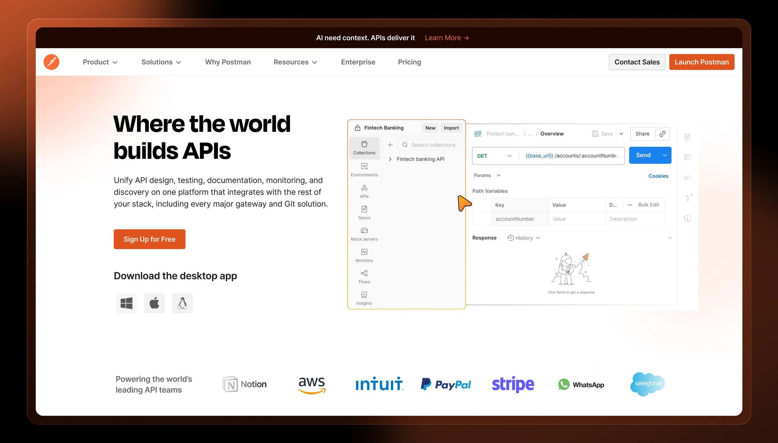
In 2026, Postman made a decisive shift, repositioning itself as an AI-native platform. That kind of change has to show up in the brand from the first impression.
I led the design of a unified color system to support that evolution, rethinking how color could communicate intelligence, adaptability, and clarity while feeling unmistakably Postman. The result bridges brand and marketing, built from a rigorous audit, grounded in real-world testing, and designed to scale.
Color System Guidelines
Color usage across Postman was audited and benchmarked against leading tech brands, with broader market research shaping the direction. From that foundation, I developed a unified, accessible color system with distinct hues mapped to key product capabilities, built to strengthen recognition and scale with the brand.
To make the guidelines more approachable, a custom interface was built using Claude, presenting the system in a structured, sequential flow that's clear and easy to move through.
Microsite & Web Guidelines
Beyond the document, I designed and built a dedicated microsite using Claude and Lovable. Light and dark mode, quick-copy values, application previews, a gradient builder, and accessibility checks give teams everything they need to stay on brand.
Color Application
The system was applied across brand and marketing touchpoints to validate its range and consistency in real-world use. These applications demonstrate how the palette holds up across formats, from digital surfaces to print, and serves as a reference for how color supports Postman's visual language in practice.

Design Explorations
The work began with a thorough audit of the tech landscape, a competitor analysis, and a review of Postman's touchpoints to understand how color would be used in context. From there, I explored and tested multiple systems, building around fixed color values until the palette felt cohesive and intentional.
